Website design for hotels, B&B’s, inns, or any boutique accommodations is a unique endeavor. It’s a balancing act to get the technical criteria right (search engine optimization, speed, etc) while showcasing a property and its destination with attractive photography, connecting with your ideal guest and removing friction to drive clicks to the booking engine through excellent user experience.
Listen to a Podcast About This Blog Post!
The home page is not the destination. In fact, the goal is to get people to click from your home page to another page on your site or your booking engine. But, it is the MOST important part of your website and sets the stage for engagement with your overall site. Therefore, we’ve used a home page as an example of what a fully optimized hotel website looks like.
At Odysys, these are the principles by which we have built all of our hotel website design templates. This is just one example of those - we have lots of designs - but we use these same principles as the starting points for all our designs. While your website doesn’t have to (and shouldn’t) look exactly like this one, you can use the principles laid out here to identify improvements you can make to your own website.
The Importance of Website Optimization During the Covid Pandemic
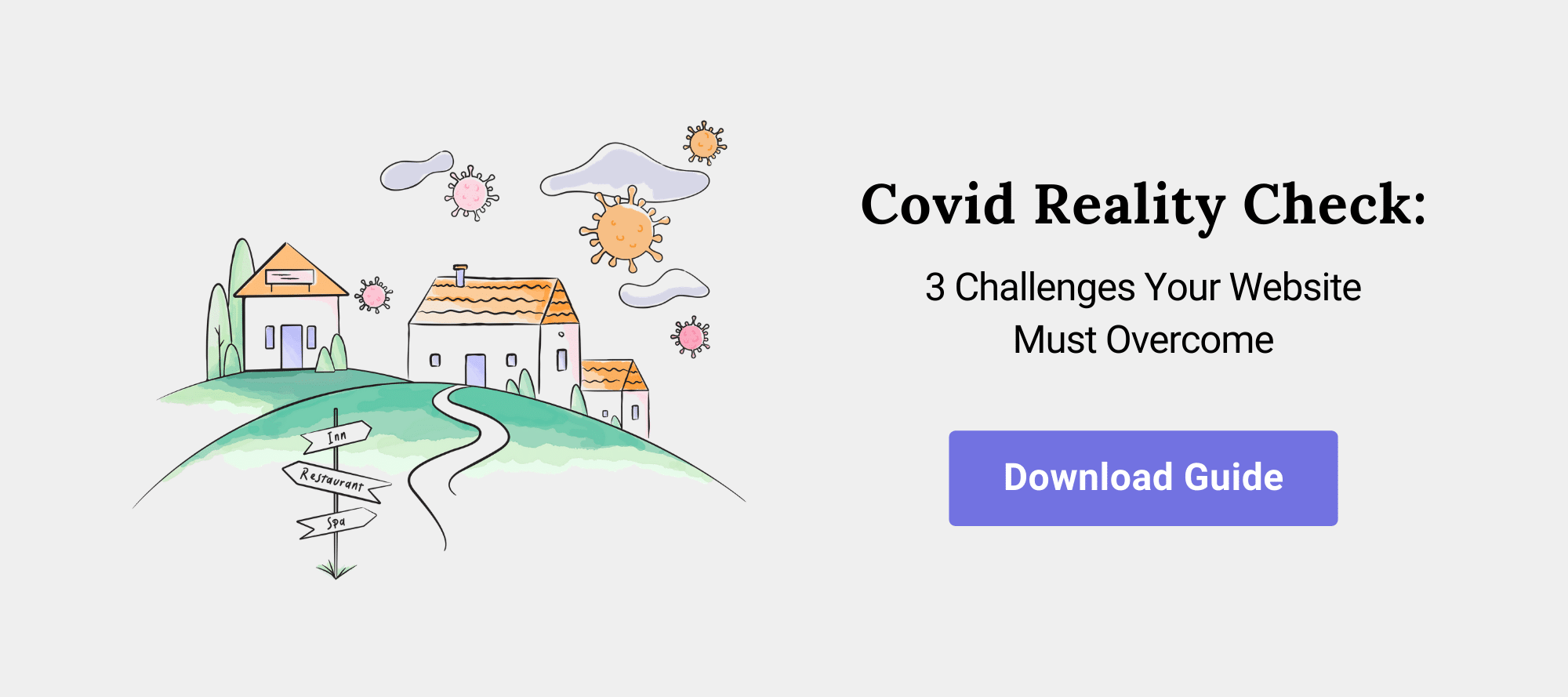
We’d be remiss if we didn’t point out that the pandemic is putting in stark relief that some properties are well-positioned to get their fair share of bookings, and others are not. It all starts with your website. We have customers that are actually having their best year ever this year. The principles we’re laying out here are the building blocks to success. Without them, you have no foundation to build on.We’ll refer to the guide that the Odysys team recently put together “Covid Reality Check: 3 Challenges Your Hotel Website Must Overcome.
The #1 challenge the industry is facing is that while there is pent-up demand for travel, the overall demand is down which means that the competition is increased. Your property will have a difficult time getting its fair share of available bookings if your website, especially your home page, isn’t technically efficient, easy to navigate, and attention-grabbing on any device.
It is also critical to clearly communicate that you’re open during Covid and demonstrate that you’re concerned about guest safety and taking every reasonable precaution by providing clear, concise Covid communication. See “Timely Information” in the infographic below for an example.
The Anatomy of a Perfectly Optimized Homepage for Independent Properties
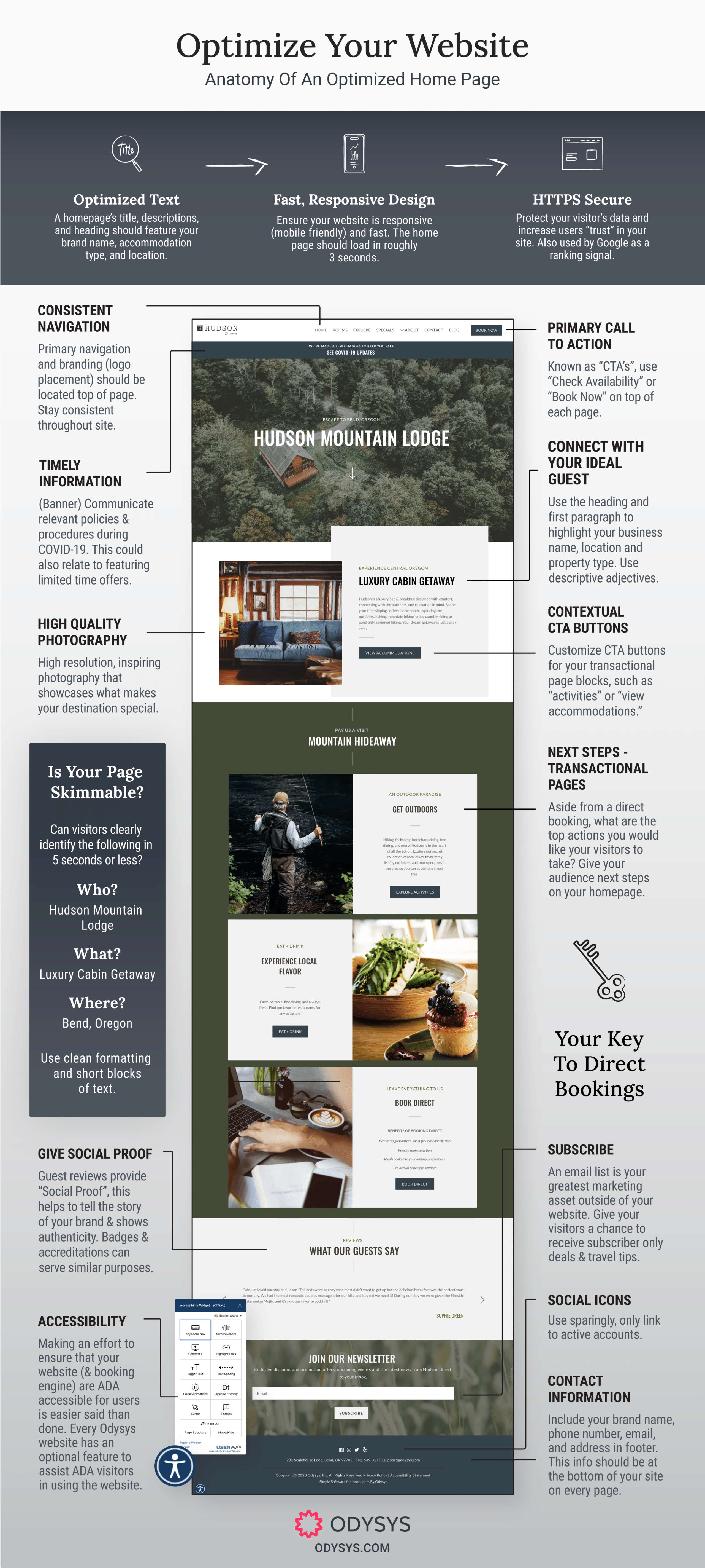
(click image to enlarge then right click to download)
Within the first couple of seconds, you need to capture the attention of your user without requiring excess concentration and careful reading. Your homepage should be clear, organized, and informational. Visitors should be able to give it a cursory glance and feel so intrigued that they read on, explore the other pages of your site, and hopefully, make a direct booking.
This is easier said than done. To help you master this essential page of your site, we’ve broken down the anatomy of an effective home page. With these building blocks in place, you will be well on your way to creating a home page that grabs visitors’ attention and welcomes them to learn more.
Clean Design & User Experience
Many people feel tempted to make their homepage as “busy” as possible with the hope that this will draw visitors in and entice them to linger on your page. This is not the case. Simple is always better. Do not incorporate music, pop-over windows, widgets with scrolling text, prominent social widgets, excessive text, or too many columns. This makes your homepage look way too cluttered and overwhelms the user.
Consistent Navigation
Your navigation bar is the roadmap visitors need to properly explore your site. It shows users where to go to look at rooms and pricing, read up on your amenities, research your location, and place a reservation. Your navigation bar should be on the top left-hand side of the page. Don’t change its location from page to page.
Primary Call to Action
The primary call to action on your website should be a button located in-line with the main navigation. User studies show that the most effective places for this button are the top right-hand corner of your website. Common CTA’s should be active with copy like ‘Book Now’ or ‘Check Availability’. Use a good contrasting color to really make it pop.
Photography
Before visitors read a single word of the text, they are going to look at the images you have displayed. That means the home page of your site should be image-heavy. You’ve probably heard us say this before: you are selling your destination, not just your accommodations. Include high-quality images of both your location and your property. Use inspirational and “aspirational”
photography. In other words, your photography should inspire the visitor to stay with you. Be strategic about it.
Select photos that immediately convey to the visitor the experience they will have if they stay with you. Don’t settle for one photo of the front door of your property. Showcase the destination and the experience. The home page can also be the place to include a video, but only if it is a really great one. An effective video won’t be more than 30 seconds long.
Welcome Statement & Overview Text
Provide a succinct welcome statement that highlights your property’s unique selling proposition and entices your visitors to explore further. Include your property name, accommodation type (ie – bed & breakfast), and location along with a descriptive adjective or two (romantic, historic, etc). You could also include a contextual call-to-action button to view your rooms/accommodations. This statement doesn’t need to explain every little thing about your property, nor does it need to detail your hotel policies. 100-300 words is plenty.
Timely Information
The uncertainty created by COVID-19 created an absolutely necessary addition to the homepage. A banner at the top of your page linking to your Covid policies and procedures is an absolute must. You don’t want to rewrite your homepage and overshadow your photos or leave your guests wondering what you are doing. This banner is non-intrusive yet allows guests to inquire more if they please. This banner is also useful for any time-sensitive information. Are you promoting a special seasonal discount? A banner may be the perfect place to put this.
Formatting: Headlines and Bullets
Your homepage should be skimmable. It needs to provide potential guests with all the information they need without requiring too much careful reading or concentration. The best way to ensure this is by using headlines, subheadings, and bullet points. This keeps your site clear & easy to read and prevents users from feeling bogged down in too much text.
Reviews
Showing that you have received positive reviews on one of these sites is very important. Research shows that 76% of customers are willing to pay more for a hotel or bed & breakfast that has received positive reviews. You can link to a trusted review source like TripAdvisor or Google on your home page or cherry-pick your best reviews and use them to your advantage. Pick one describing your great location, another raving about your breakfast, and a third outlining the luxurious amenities.
Industry Badges & Social Proof
Social proof doesn’t mean social media widgets. Social proof means providing concrete evidence that your business is trustworthy and respected. Whether that’s a TripAdvisor Certificate of Excellence, a badge showing your membership in the chamber or industry association, or even a BBB or AAA rating, including these “social proofs” go a long way to show potential guests that you are a trustworthy and well-regarded property. Place these in your footer.
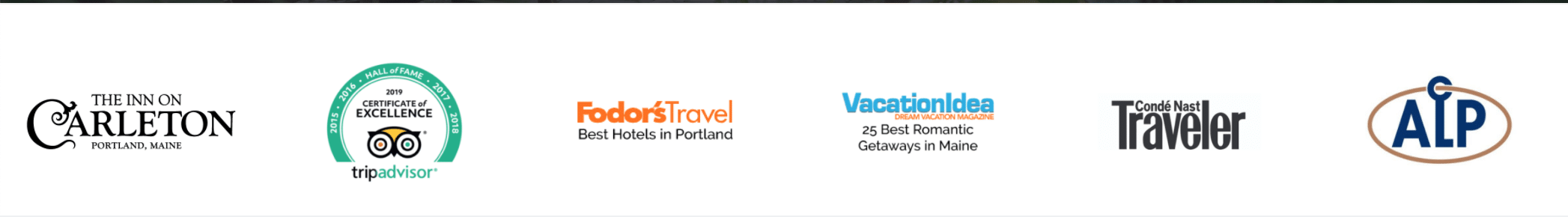
The Inn on Carleton has been featured in several highly ranked publications and features their logos right above the footer of their homepage. Guests who are unfamiliar with the area or the inn can feel better knowing that they are a well-regarded property.
Contextual Calls to Action
Within the text you write, be sure to incorporate buttons that lead into your other pages. These will encourage visitors to click onto other pages of your site and stay longer. Use action-based phrases. Instead of ‘Rooms’ or ‘Weddings’ tell your guests to click on them by saying ‘Plan Your Dream Wedding’ or ‘View Accommodations’.
Encourage Subscribers
It is important to keep in mind that visitors to your website are at different stages in their journey to making a booking. Some might not be ready to book a stay quite yet. Have a signup form for your email newsletter. This gives you an opportunity to stay in touch and drive a direct booking later on. Learn more about building your newsletter audience on our blog post Why Email Marketing is a Gold Mine.
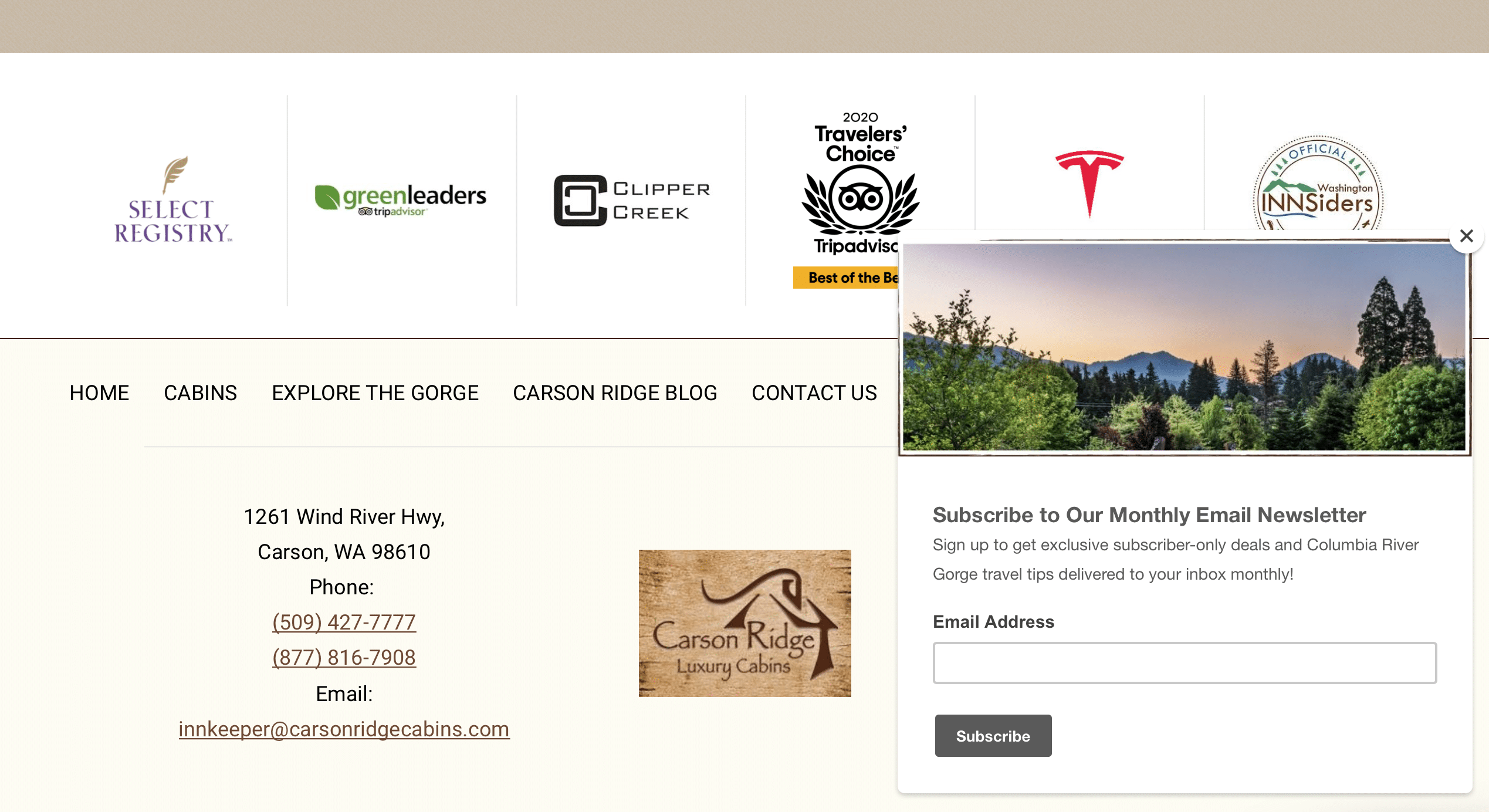
Carson Ridge Cabins has a slide-in email subscribe form pop-up when users get to the bottom of the page. This non-intrusive form allows users to sign up and receive your discounts and travel tips.
Contact Information
This may sound obvious, but always provide your contact information and make sure it is clear and easy to access. Even if you have a “Contact Us” page on your site, this vital information should be on your homepage as well. That means providing your phone number, email, and address. A map doesn’t hurt either. Your phone should be click-to-call and email should be clickable as well.
Social Icons
We also encourage you to link to your social media profiles, but a word to the wise: these logos should not be prominent parts of the page. Make them subtle so guests can find them if they look for them. Furthermore, only link to social sites if you are active on them.
Behind the Scenes: Technical & SEO
Have a Unique Selling Proposition
Use your home page to showcase what makes your property unique. Is your property a romantic escape? Then I better see lots of pictures of loving couples having a romantic time. Do your guests flock to your property as a gateway to the outdoors? Or to visit a certain local attraction? Display this on your home page and reflect it in your overview text.
Mobile-Friendly/Mobile-Responsive Design
The home page (and all pages of your website) should work great no matter the screen size. Google is using the mobile version of your home page to determine rankings. Make sure your home page passes Google’s mobile-friendliness test and that all your content is accessible on a mobile device.
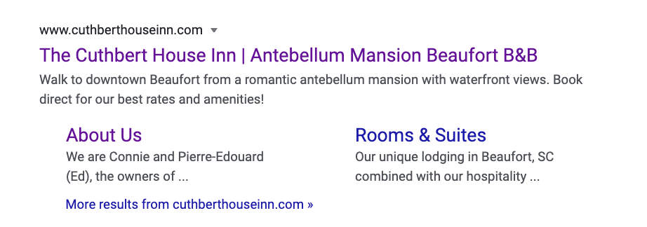
Optimized Page Title & Meta Description
Every page on your website should have a unique page title and meta description. To dive into the importance of title tags and meta descriptions and learn how to optimize them for every page, watch our innkeeper webinar.
- Page Title: Your home page title tag is key to your rankings. It must be under a certain length (currently 600 pixels or 60 characters including spaces max). We typically encourage a combination of your property’s name, accommodation type, location, and if there’s room, an adjective. The adjective can entice a click and set you apart from the other results on the page.
For an easy title tag: Property name, adjective, property type in your location. Something like Cedars of Williamsburg, a Historic B&B in Williamsburg VA will help users identify what your property is about.
- Meta Description: Meta descriptions do not influence rankings at all. This is your opportunity to write an ad for your property that appears in the search results. Our basic advice is to describe your property, highlight your unique selling point, and include a call to action. There’s been quite a bit of experimentation by Google lately. Traditionally your meta description should be less than 160 characters (including spaces) but we’re seeing Google include descriptions as long as 300 characters. The optimal length will vary for your property.
Example meta description: Situated in a historic building and neighborhood, our deluxe B&B rooms and suites feature modern amenities and kitchenettes and are close to dining, shopping, and nightlife. Book direct online!
The Cuthbert House Inn has a sweet and simple title tag and meta description that advertises their unique selling proposition and includes all important information.
Bot Accessible / XML Sitemap
Search engine crawlers should be able to easily crawl your entire page. Do not have multiple URLs for your home page (ie – www.yourwebsite.com and www.yourwebsite.com/index.html and m.yourwebsite.com). Also be sure to have an XML sitemap of all your website’s pages (typically located at www.yourwebsite.com/sitemap.xml)
Great Booking Engine Experience
What is the point of a homepage? To encourage people to book direct and funnel them into your booking engine. Your booking engine should work just as smoothly as your home page. Users will leave if it takes too many steps to book or get the desired information (like availability and rates for a certain date range).
A great homepage is one of the most important pieces of your website and a key part in overcoming the challenges created by COVID-19. Download our free guide and learn about what you can do to overcome these challenges and increase your bookings.